Population Density & Travel Demand
I’m in a mapping mood thanks to this last post and thought I’d share these two. They show population density and travel demand in England’s north west region – the counties of Lancashire, Cumbria and Cheshire.
The left hand map shows the distribution of population density, with the ‘core cities’ of Liverpool (c. 1.5 million) on the west coast and Manchester (c.2.5 million) 35 miles east.
The right hand map shows where the demand for personal travel is most intense (in kilometres per year distance).
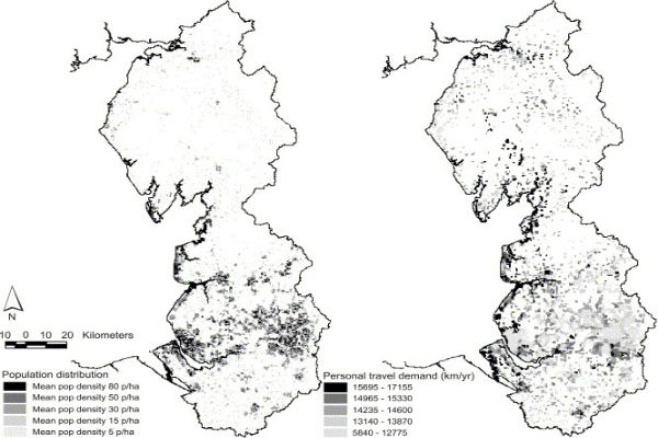
Side by side maps of England’s North West showing population density and travel demand
The plans reveal interesting differences, and of course similarities.
Firstly, you can see from the left hand map that Liverpool, although containing many district centres, is quite a singular metropolitan entity, with a relatively compact and dense settlement pattern, despite damaging clearance of its central neighbourhoods. This compact form is broadly a good thing in sustainability terms.
Greater Manchester is more ‘polycentric’ – it has many centres, having sprawled over a wider area to encompass big towns like Oldham, Bury and Stockport.
On the right hand map you can see that both cities (unsurprisingly) generate the greatest demand in km/year for personal travel from their suburban hinterland. You can see that the pleasant Liverpool Bay coastal settlements from west Wirral up to Southport and Blackpool show strong travel demand. These towns are commuter friendly, well linked by electrified (or soon to be electrified, in the case of Blackpool) rail services to both core cities. These plans do not show the ‘modal split’ between roads and railways.
You can also clearly see Manchester’s southern commuter belt round Stockport, Altrincham and into north Cheshire – these are wealthy areas of low development density but high travel distance demand.
The right hand plan shows the region’s rural settlements generating a greater demand for travel distance than their population density distribution, suggesting that people travel out to access employment and services. This is especially clear up the M6 corridor past Lancaster and Morecambe Bay, as well as the more remote areas of Lancashire and Cheshire. With so many rural rail services dismantled during the 1960s, and weaker rural bus provision, these journeys are likely to be by car.
The fact that the metropolitan core areas show a lower demand for travel distance relative to their high population densities indicates that more needs can be satisfied locally – the essential benefit of city living!
Of course, if the indicator were changed from travel distance in kilometres per year to the actual number of trips, and highlighted different modes of transport including foot and bike, the core urban areas would show a very different demand pattern. As census data is released and mapped, I’ll keep you posted.
15th Feb 2013 – MacMax Architecture principle Peter McGurk RIBA has produced some fascinating reflections on how networks can generate as well as respond to demand, in relation to Liverpool’s development density and movement infrastructure:
http://petermcgurk.blogspot.co.uk/2013/02/a-map-that-speaks-thousand-words.html
http://petermcgurk.blogspot.co.uk/2013/01/buses-bikes-and-shanks-pony.html
By the way, this is the source of the map – from an academic article about air quality:
http://www.sciencedirect.com/science/article/pii/S0048969704003614